Rally first
Navigation, motion, terrain, and rider reality come before decoration.
Alakonnu Rally 2026
One working guide for the event mark, typography, voice, imagery, and layout behavior.
This guide is built from the current website tokens, poster system, and public campaign assets. Downloadable files live on the separate media-assets page.
Working focus
One system across site, decks, and email
This page holds the rules. Reusable files, photos, and banners live separately in the media-assets library.
01
Alakonnu should feel like a real rally weekend in Southern Estonia: practical, high-energy, slightly dusty, and never over-designed.
Navigation, motion, terrain, and rider reality come before decoration.
The tone can be rough-edged, but the information must stay clean and easy to act on.
Orange is the event signal. Let it dominate hero moments and stay disciplined elsewhere.
Condensed type, simple layouts, and clear hierarchy matter more than ornamental styling.
02
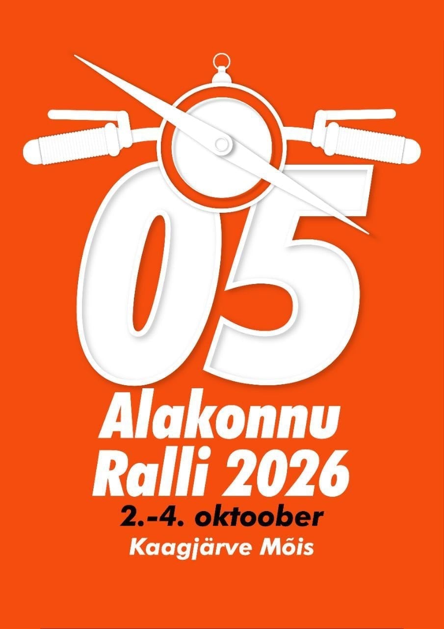
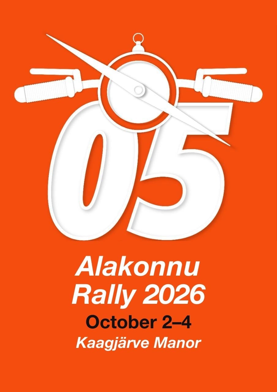
The core mark is the square 05 badge. Use the poster lockup when date and place matter, and the landscape social image when the asset needs quick shareability.
Usage rules
Primary avatar and app-style mark. Best for icons, thumbnails, and sponsor sheets.
Use when date and venue need to travel together with the brand.
Use the transparent white logo from Talis Taim's 9 June email when the mark needs to sit on certificates, partner decks, or coloured backgrounds.
Orange-background logo reference from the same 9 June email. Useful when the logo should stay tied to the rally orange surface.
Use this rally mark from Talise's 2026 design when the logo, date, and venue should stay together.
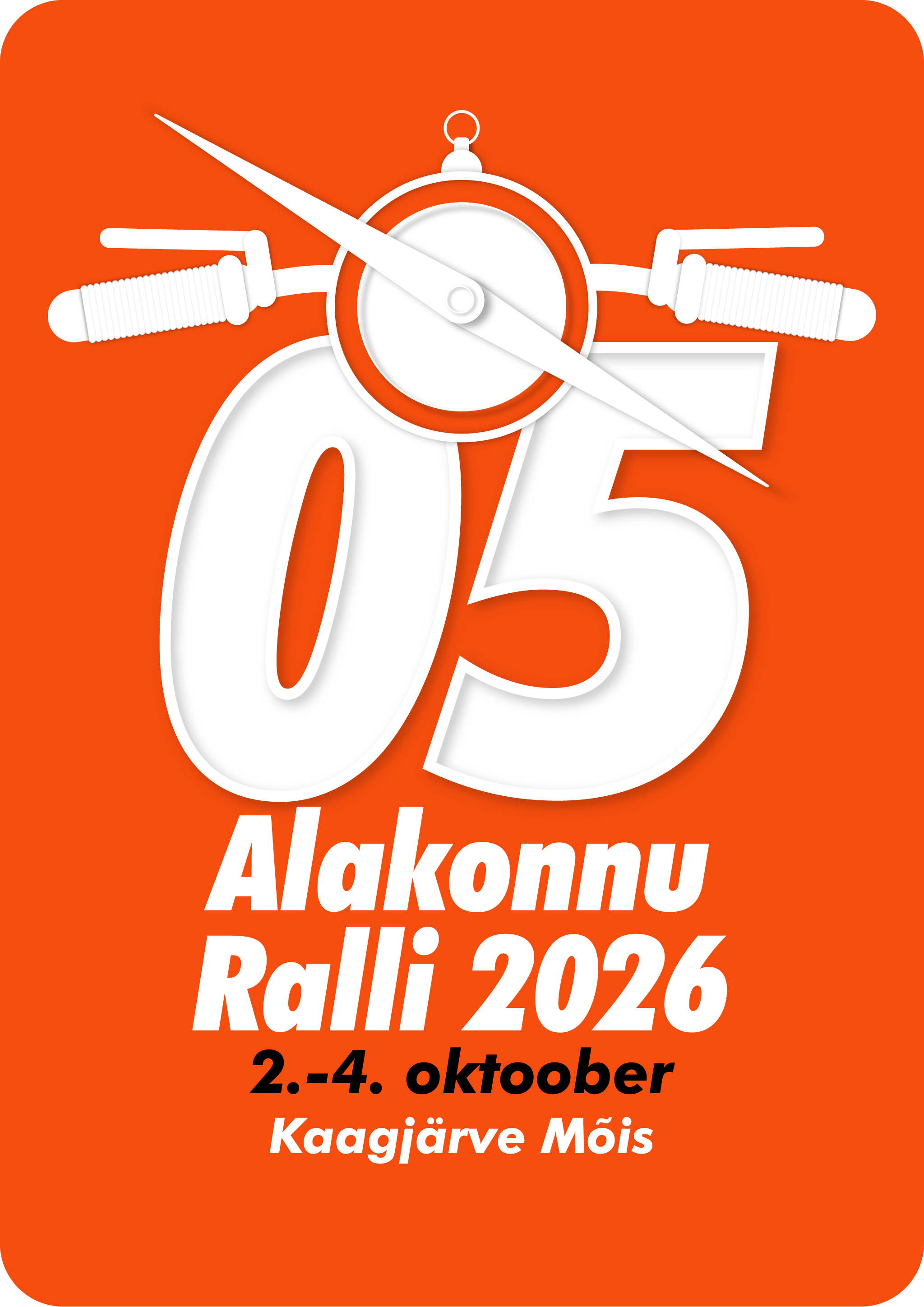
Use the 2026 poster-style PNG when the orange date-and-venue artwork should retain transparent rounded outer corners.
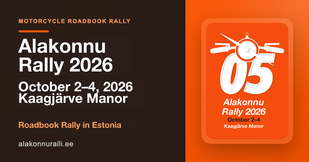
Landscape lockup for link shares, press decks, and event announcements.
03
The palette comes from the poster: rally orange, mud-dark contrast, and sand-toned surfaces that keep long-form content readable.
#FF4D00
Hero backgrounds, CTA buttons, section anchors, and dominant event color.
#1A1815
Body copy, navigation, strong contrast blocks, and footer surfaces.
#E8E4DC
Soft cards, neutral sections, and document-style surfaces behind content.
#F5F2EC
Page canvas and calm spacing around louder orange blocks.
#2D4A3E
Secondary actions, terrain-inspired accents, and partner/support content.
#FFB800
Alerts, urgency, and limited-use attention cues.
04
Bebas Neue carries the campaign drama, Barlow Condensed carries the UI and section rhythm, and Barlow handles everything that needs sustained reading comfort.
Display
Use for event marks, oversized numerals, and loud campaign moments.
Heading
Use for section titles, CTA labels, and compressed utility copy.
Body
Use for paragraphs, instructions, and all reading-heavy surfaces.
05
Write like an organizer speaking to riders and partners directly. The brand voice should feel competent, grounded, and a little dusty, not corporate or luxurious.
Lead with what matters now: date, route, ticket status, next action.
Use real places, distances, and outcomes instead of vague hype phrases.
Speak like the event knows what it is. Avoid apologetic or overly polished wording.
Respect the audience's competence. Give useful detail without over-explaining basics.
06
Imagery should feel editorial and terrain-led: dust, route notes, rider focus, and service-camp texture. Prefer real rally photography first. Generated concept plates are secondary mood guidance, not documentary proof.
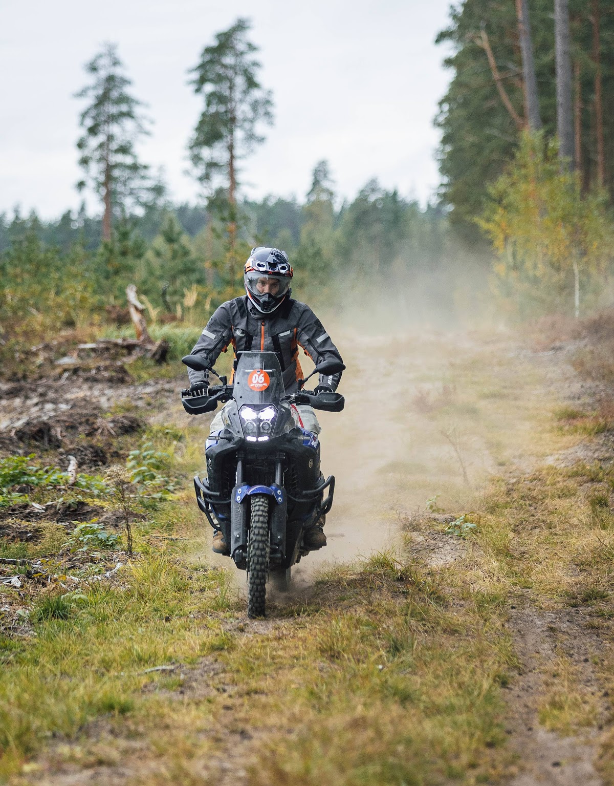
Prefer clean real gallery photography like this for email headers, partner decks, and first-line brand storytelling.
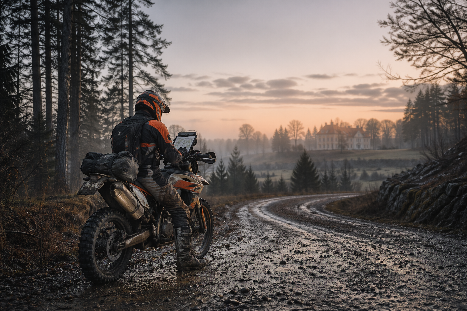
Use for keynote covers, season reveal pages, and atmosphere-led hero sections.
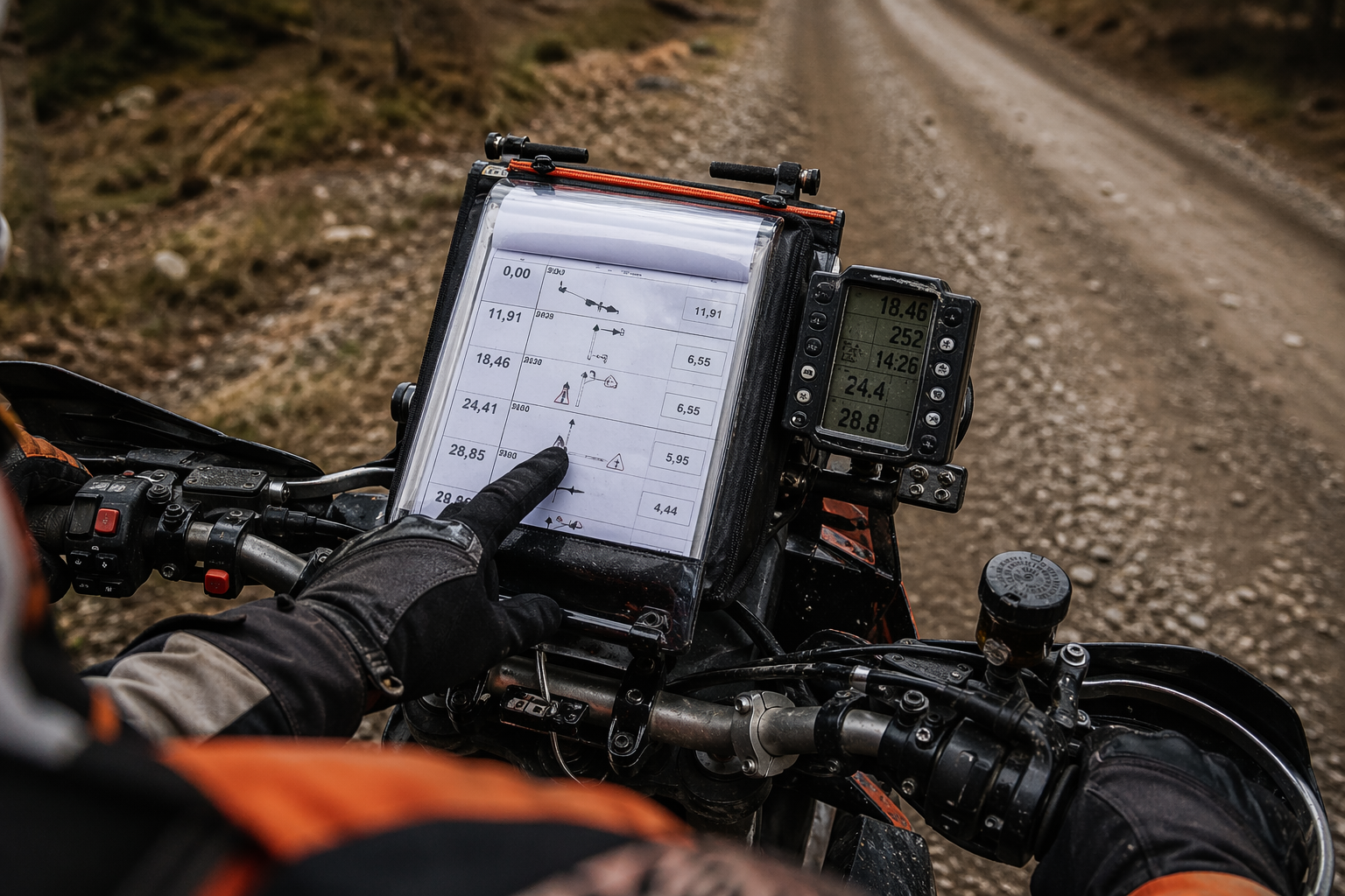
Close-up detail that supports instructional, technical, or training-oriented copy.
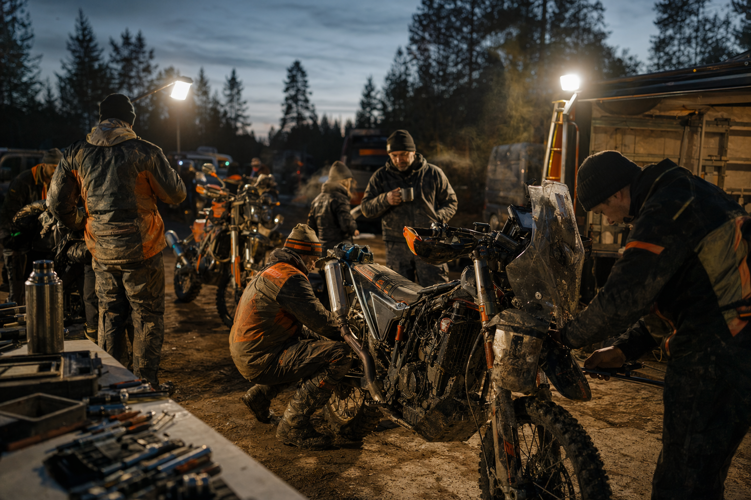
For recap decks, volunteer recruitment, and community-driven storytelling.
07
The brand should scale across web UI, posters, social tiles, and partner-facing documents without changing personality.
Lead with the orange poster system, then support with clean cream or sand layouts.
Keep one dominant message, bold condensed type, and a single visual focal point.
Use mud-black text on light grounds with orange only where action or emphasis matters.
Keep live emails lightweight and text-first. Treat the image-based email headers on the media-assets page as mockups or planning references, not default production email content.
All public rally photos, logos, posters, social previews, email mockups, branding banners, and generated support plates are grouped on the dedicated media-assets page.